The Nike Air Presto as never explained before
More often than not, the exploration of any major Nike model’s history is going to be predictable. The Nike Air Presto is, admittedly, no exception to this.
That predictability comes in the form of discussions surrounding the shoe’s technological background. More importantly, it centers on the external conditions – culture, consumer need, tech progress – that lead to a shoe’s design.
There’s a reason this discussion is so relevant regardless of the shoe itself. Nike has in its history a couple of decades – between the 80s and 2000s – when it is faced with challenge after challenge.
It was as though every year was a new chance to feel a bit behind on consumer trends and respond in kind. With the Nike Air Presto, this notion of timing meeting inspiration – some would call it a coincidence – plays out profoundly.
Nike Air Presto: a shoe for the runner with the runners
In 1996, Tobie Hatfield was working his way through a stint as Footwear Developer with Nike. In contrast with his current seniority, Hatfield had then been looking for a way to both leave his mark and help the Swoosh become a go-to for runners.
In this effort, he was taking a trip to Korea when he was given a pair of recently released runners. When he stood up in them, the sides of the ankle color splayed out in the classic sign of an awkward fit.
This definitely wasn’t the first time Hatfield, or Nike, had to deal with this perspective. Thanks to a bevy of focus groups, Nike heads understood that runners wanted a shoe that worked with them.
The traditional running shoe, led in many ways by the Air Max line in those days, focused on support and containment. Though these were classic design staples of runners both elite and standard, consumers wanted more.
Specifically, what had been sought after was an upper that presented a 1-to-1 fit. Rather than the usual leather or mesh combo, these runners needed something that fit more like a sock. The splaying ankle collar was a reminder of this need for a customizable fit.
Hatfield creates a unique kind of shoe
 Nike Air Presto Flyknit Original Sketch
With these thoughts going through his mind – and not far removed from trying on the splaying shoe – Hatfield did what he does best. He designed a proposed solution to the fit issues that runners were facing, opting for some interesting innovations.
To combat the splaying, Hatfield proposed a V-Notch between the heel portion and midfoot. Though exposing the ankle, this carved out section seemed to vastly improve overall fit.
The interesting thing here is that Hatfield wasn’t aware just how innovative this was. After creating a prototype for that earlier design, Hatfield wanted to get into some testing.
He’d decided not to wear the shoe himself, avoiding any effects of bias. Instead, he’d lent the shoe to a co-worker who was a size 11. After giving it a go, the response was more than positive.
The co-worker mentioned how great the fit was and how seamless it all felt on-foot. The kicker? The shoe was actually a size 9.
As you can imagine, there was some shock at realizing this. The co-worker wasn’t aware that he was given a shoe that was a full two sizes down. As such, his great reviews on the fit surprised both himself and Hatfield.
In response, the footwear design crew get right to work. Pulling together tech innovations and design philosophies, the road to the Nike Air Presto was being built.
The prototype inspired more focus on this category as Nike had stumbled onto something special. The Swoosh was on the cusp of a truly revolutionary piece of footwear design: a shoe that could be sized like a t-shirt.
Air Presto: From usual sizing to t-shirt sizing
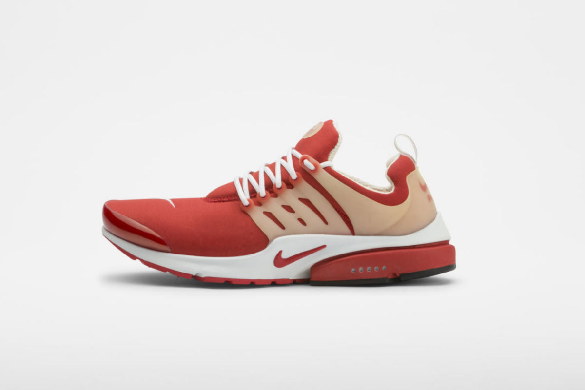
Thanks to the V-notch – and some eventual material expertise – the Presto made the traditional numerical sizing system almost completely unnecessary. Instead, they could range the shoes from XXXS to XXXL.
The first piece of this new effort was the Nike Gauntlet, released back in 1998. This was a formative moment for Nike as it presented the use of two very important pieces of sneaker design: stretch mesh on the upper and a heel clip.
Both of these features came together with the V-notch to make for a shockingly customizable fit. It’s those three technologies that would lead to the Presto we know today.
After a release of the next phase in this process, the Nike Air Zoom Drive back in 1999, the Nike Air Presto would come to life. In the year 2000, there was just one problem to get over: what was the upper going to be? Up to this point, the external features, like the outsole and midsole, were pretty much accounted for.
But, the upper was a more complicated issue. Remember, this is long before Nike was throwing Flyknit on every shoe. With that being the case, it was time to get creative. They would decide on a material known as spacer mesh.
Combining breathability with a capacity for stretching, this was exactly what the Nike Air Presto needed. Now that the tech was taken care of, it was time to focus on another aspect of Nike’s dominance: marketing strategy.
The Swoosh came together with its now long-term advertising partner as well as the larger design community to both create new colorways and advertise them. Some of the colorways weren’t quite as popular as others, but each was wild.
The inspiration came from expressive graphics and each iteration was marketed along with a cheeky poster. Even the names were incredible – “Shady Milkman,” “Unholy Cumulus,” “Catfight Shiner,” just to name a few.
The Nike Air Presto thus becomes one of those Nike items that are just as heralded for their visuals as they are for functionality – if not more so! It’s remarkable to think that it all started with Tobie Hatfield looking to address what is now a fundamental part of designing runners. Almost accidentally, the Swoosh went and changed the whole game.
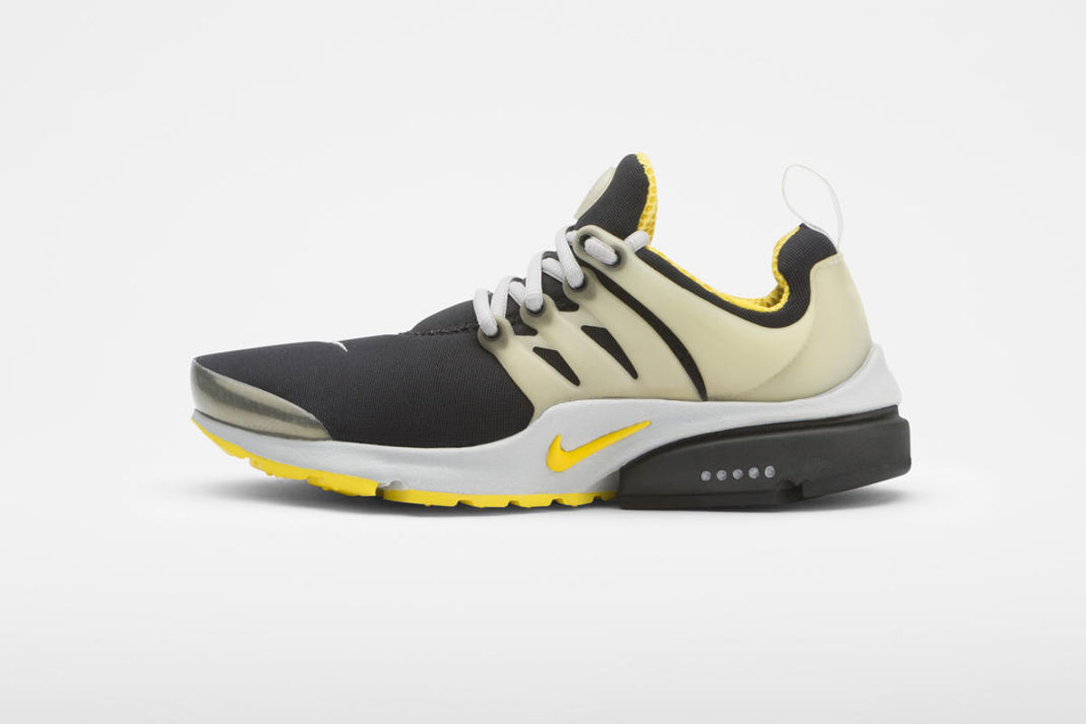 Nike Air Presto Brutal Honey (2000)
All Images Courtesy of Nike